5. Dimensionality reduction by Subspace projections#
Lets assume that there is a random design matrix, \(X\), whose dimensions are \(n\times p\), where \(n\) is the number of samples and \(p\) is the number of features.
The dimensionality of every sample is the number of features, \(p\).
Dimensionality reductions means transforming the data from a high dimensional (\(p\)) representation to the lower dimensional representation (\('\)), still retaining usefull properties of the original data. When dimensionality reduction is applied to matrix \(X_{n\times p}\) the resulting reduced matrix, \(X_{n\times p'}\) will have as many samples as the original matrix, but the number of features is reduced.
These goals can be met, if the projection method is first fitted to the data, so that the axis of new \(p'\) dimensional space are aligned optimally to the data.
5.1. Principal Component Analysis (PCA)#
PCA is one of the most well known dimensionality reduction methods. It transforms the set of observations with possibly correlated variables (=features) into a set of values of linearly uncorrelated variables, called principal components.
PCA transformation is defined in such a way that the first principal component has the largest possible variance and the rest of the components are ordered according to their variances in descending order.
PCA can be used as a dimensionality reduction method by removing some of the least important variables, and keeping the first most important.
This is very convenient, since the variables in high-dimensional problems are often correlated. The high dimensionality and co-variance between the features makes many statistical methods inapplicable. Eliminating the covariance and reducing the dimensionality makes many methods working better.
PCA was invented in 1901 by Karl Pearson, as an analogue of the principal axis theorem in mechanics; it was later independently developed (and named) by Harold Hotelling in the 1930s.Depending on the field of application, it is also named thediscrete Karhunen Loeve transform (KLT) in signal processing, the Hotelling transform in multivariate quality control, singular value decomposition (SVD), and eigenvalue decomposition (EVD).
Mathematically PCA projection works like this: $\( Y_{n\times p'} = X_{n\times p} ~ E_{p\times p'}, \)$
where \(n\) is number of samples, \(p\) is number of variables (or features), \(p'\) is possibly reduced number of features, \(X\) is the design matrix, input to PCA, \(E\) is matrix of eigenvectors, \(Y\) is a matrix of principal components, projections.
The most important component of \(Y\) is the first column, and the rest of them carry less information in decreasing order. Dimensionality reduction is achieved by simply discarding the rightmost columns of \(Y\).
Original data can be reconstructed as follows: $\( X_{n\times p} = Y_{n\times p'} ~ E_{p'\times p}, \)$
Eigenvalues and eigenvectors can be calculated for example using Singular Value Decomposition (SVD) $\( X = USV^T, \)\( where S is the diagonal matrix of singular values (eigenvalues) \)s_i$ and columns of V are principal directions/axis (or eigenvectors).
See references 1-4
import numpy as np
import pandas as pd
import seaborn as sns
import matplotlib.pyplot as plt
sns.set()
k=0.1
N=100
x1=np.random.rand(N)
x2=k*np.random.rand(100)+(1-k)*x1
x2=k*np.random.normal(0,0.5,size=N)+(1-k)*x1
X=np.vstack((x1,x2)).T
m=np.sqrt(x1**2+x2**2)

def plotData(X, ax=None, xlab=None, ylab=None, title=None, noline=False, fs=True):
    if ax==None:
        ax=plt.gca()
    ax.scatter(X[:,0], X[:,1], c=m, cmap='rainbow')

    minx=X.min()
    maxx=X.max()
    if not noline:
        C=np.cov(X.T)
        x=np.linspace(minx, maxx, 10)
        k=C[1,1]/C[0,0]
        k2=-1/k
        y=k*x
        middle=(minx+maxx)/2
        length=(maxx-minx)*0.1
        x2=np.linspace(middle,middle+length,10)
        y2=k2*x2+(k*middle - k2*middle)
        ax.plot(x,y,'r')
        ax.plot(x2,y2,'r')

    if fs:
        ax.axis([minx, maxx, minx, maxx])
    else:
        ax.axis([X[:,0].min(), X[:,0].max(),
                 X[:,1].min(), X[:,1].max()])

    if title:
        ax.set_title(title)
    if xlab:
        ax.set_xlabel(xlab)
    if ylab:
        ax.set_ylabel(ylab)
5.2. Projecting linear data#
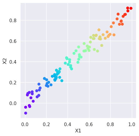
Visualize the data first. Plot the points in the 2D dataset as scatter plot, using the magnitude of values (\(\sqrt{x_1^2 + x_2^2}\)) as color index. Big values will be plotted as red, and small values as blue.
m=np.sqrt(X[:,0]**2+X[:,1]**2)
plt.figure(figsize=(5,5))
plt.scatter(X[:,0], X[:,1], c=m, cmap='rainbow')
plt.xlabel('X1');plt.ylabel('X2');
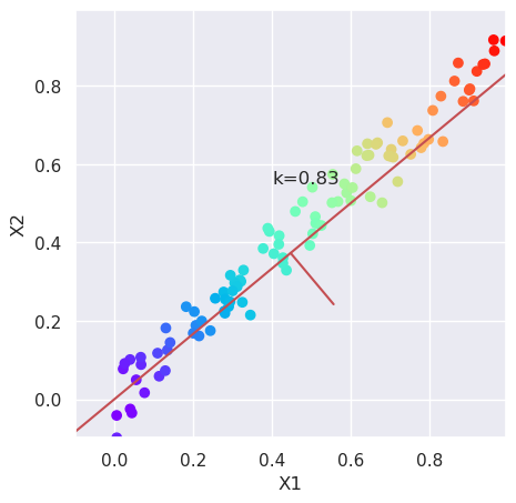
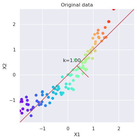
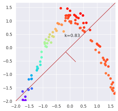
5.2.1. Calculate new coordinates with maximum variance#
# Calculate the angle of maximum variance using the variances
# of variables, and calculate the reciprocal, k
var=X.var(axis=0)
k=var[1]/var[0]

# Plot the data and the direction of maximum variance, and the
# orthogonal direction
plt.figure(figsize=(5,5))
plotData(X, xlab='X1', ylab='X2');
plt.text(0.4, 0.55, "k=%4.2f" % (k));
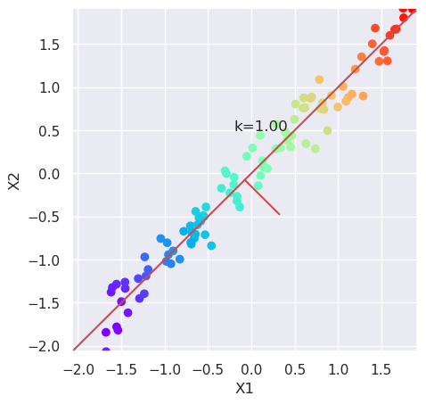
5.2.2. Scale the data and plot it again#
from sklearn.preprocessing import scale
plt.figure(figsize=(5,5))
Xs=scale(X)
plotData(Xs, xlab='X1', ylab='X2')
var=Xs.var(axis=0); k=var[1]/var[0]; plt.text(-0.2, 0.5, "k=%4.2f" % (k));
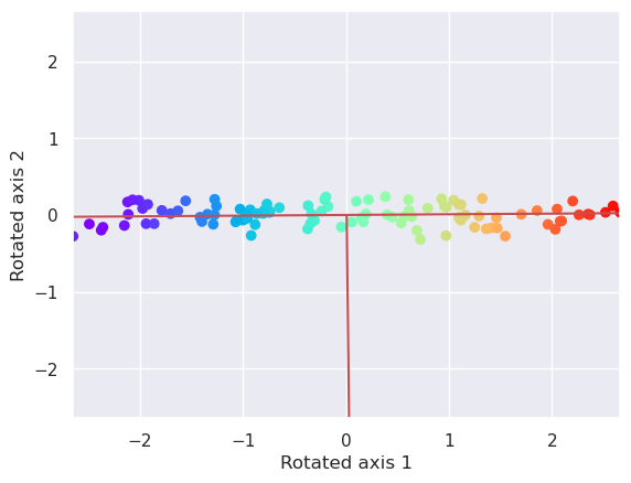
5.2.3. Plot the data along these new axis by rotating the data with Affine transformation#
where \(\phi\) is the rotation angle.
The tangent of the rotation angle can be calculated by using variances of X along both axes: \( \tan(\phi) = \frac{\rm{var}(X_2)}{\rm{var}(X_1)} \)
var=Xs.var(axis=0)
k=var[1]/var[0]

cost=var[0]/np.sqrt(var[0]**2 + var[1]**2) # Cosine of the rotation angle
sint=var[1]/np.sqrt(var[0]**2 + var[1]**2) # Sinus of the rotation angle
R=np.array([
    [cost, sint, 0],
    [-sint, cost, 0],
    [0, 0, 1]])
X3d=np.vstack((Xs.T,np.ones(N))).T
Xr = (R @ X3d.T).T
plotData(Xr, xlab='Rotated axis 1', ylab='Rotated axis 2')
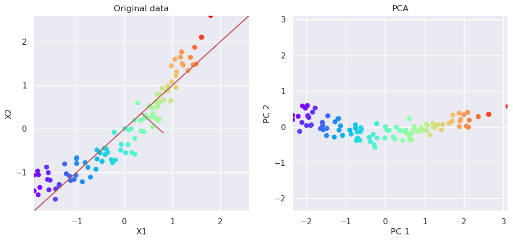
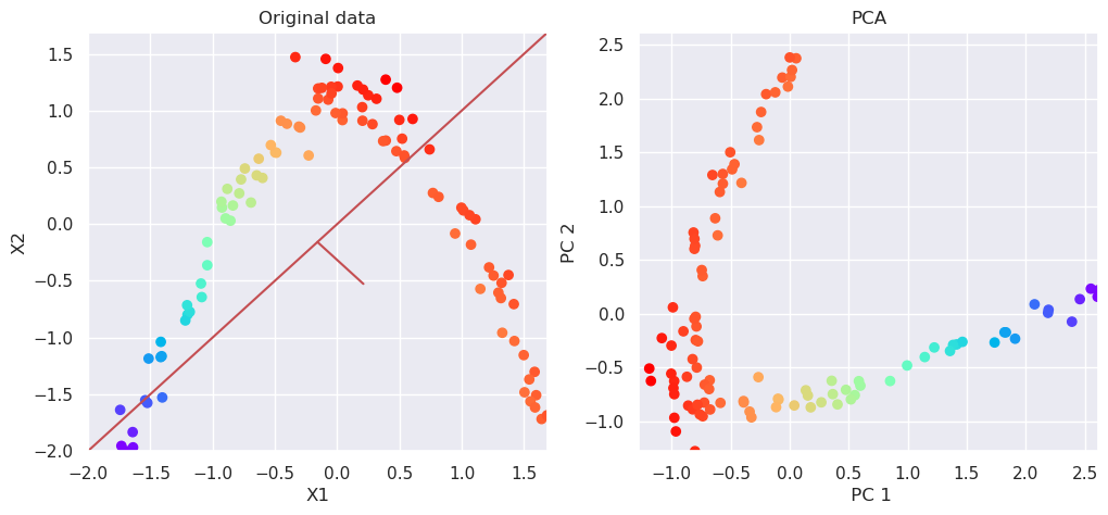
5.3. PCA: How to do all previously shown steps for you#
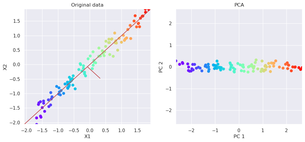
from sklearn.decomposition import PCA

# Perform PCA decomposition
pca=PCA(n_components=2)
Xp=pca.fit_transform(Xs)

# Plot the original data and transformed data side by side
fig, (ax1, ax2)=plt.subplots(nrows=1, ncols=2, figsize=(12,5))
plotData(Xs, ax1, xlab='X1', ylab='X2', title='Original data')
plotData(Xp, ax2, xlab='PC 1', ylab='PC 2', title='PCA', noline=True)
pca.explained_variance_ratio_
array([0.9913109, 0.0086891])
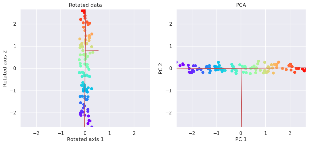
5.3.1. PCA is based on singular value decomposition#
Singular alue decomposition, decomposes matrix X into three components
U,S,E = svd(X)
S is the eigenvalues of X and E contains the eigenvectors of X. The rotation of the data along coordinates with maximum variance is taken care by simply matrix multiplication:
from numpy.linalg import svd
U,S,E=svd(Xs)
print(E)
print("Equals")
print(pca.components_)
Xr=Xs @ pca.components_
[[ 0.70710678  0.70710678]
 [ 0.70710678 -0.70710678]]
Equals
[[ 0.70710678  0.70710678]
 [ 0.70710678 -0.70710678]]
fig, (ax1, ax2)=plt.subplots(nrows=1, ncols=2, figsize=(12,5))
plotData(Xr[:,[1,0]], ax1, xlab='Rotated axis 1', ylab='Rotated axis 2', title='Rotated data')
plotData(Xp, ax2,  xlab='PC 1', ylab='PC 2', title='PCA')
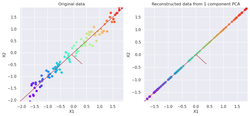
5.3.2. Reconstruct data#
pca=PCA(n_components=1)
Xp=pca.fit_transform(Xs)
Xreconstructed=pca.inverse_transform(Xp)
# Plot the original data and transformed data side by side
fig, (ax1, ax2)=plt.subplots(nrows=1, ncols=2, figsize=(12,5))
plotData(Xs, ax1, xlab='X1', ylab='X2', title='Original data')
plotData(Xreconstructed, ax2, xlab='X1', ylab='X2', title='Reconstructed data from 1 component PCA')
5.4. Non-Linear data#
k=0.1
N=100
x1=np.random.rand(N)
x2=k*np.random.rand(100)+(1-k)*x1
x2=k*np.random.normal(0,0.5,size=N)+(1-k)*x1**2
Xnl=np.vstack((x1,x2)).T
m=np.sqrt(Xnl[:,0]**2+Xnl[:,1]**2)
plt.figure(figsize=(5,5))

Xs=scale(Xnl)
plt.figure(figsize=(5,5))
plotData(Xs, xlab='X1', ylab='X2', title='Original data')
var=Xs.var(axis=0); k=var[1]/var[0]; plt.text(-0.2, 0.5, "k=%4.2f" % (k));
<Figure size 500x500 with 0 Axes>
5.4.1. Try PCA#
# Perform PCA decomposition
pca=PCA(n_components=2)
Xp=pca.fit_transform(Xs)

# Plot the original data and transformed data side by side
fig, (ax1, ax2)=plt.subplots(nrows=1, ncols=2, figsize=(12,5))
plotData(Xs, ax1,xlab='X1', ylab='X2', title='Original data')
plotData(Xp, ax2,xlab='PC 1', ylab='PC 2', title='PCA', noline=True)
pca.explained_variance_ratio_
array([0.96808636, 0.03191364])
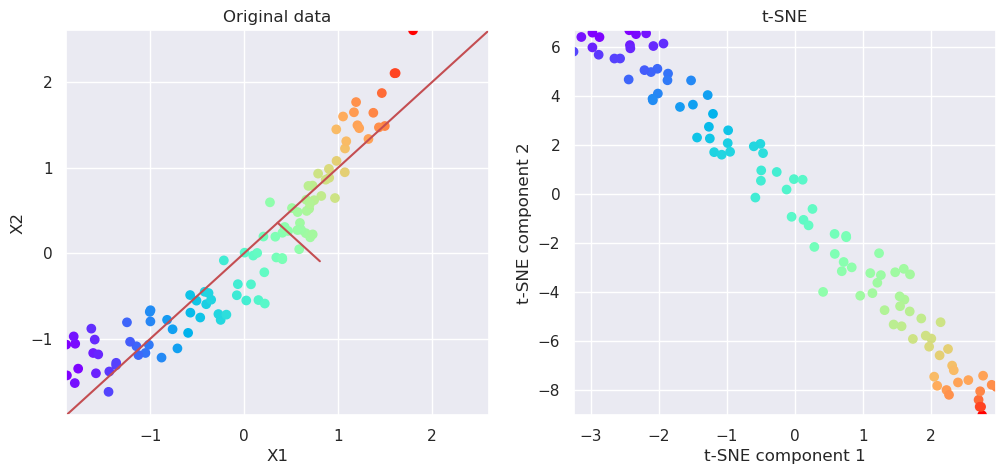
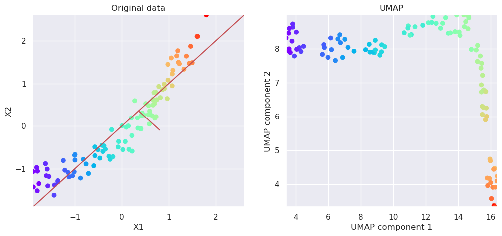
5.5. Manifold learning#
Manifold learning methods are non-linear algorithms for mapping the multidimensional data into the lower dimension by unfolding the manifold. While doing so, they try to keep the local neighborhood similar than it was before the transformation. It means that those samples which were neighbours in the original multidimensional space, should be neighbors also in reduced subspace.
Two often used methods are T-distributed Stochastic Neighbor Embedding t-SNE and Uniform Manifold Approximation UMAP.
t-SNE is part of sklearn, but umap needs to be separately installed, like pip install umap-learn.
If you want to isntall also special UMAP plotting tools, then run pip install umap-learn[plot] as well. But it is not mandatory, since matplotplit can plot everything necessary.
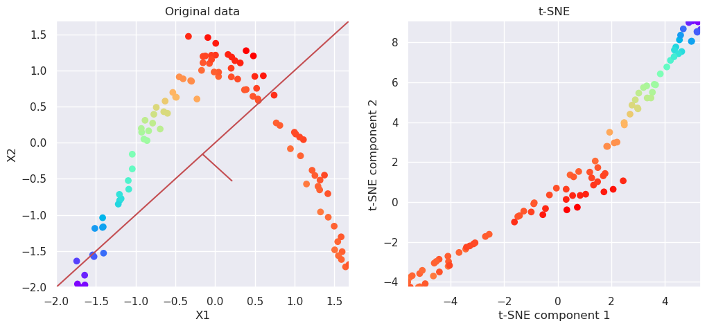
from sklearn.manifold import TSNE
tsne=TSNE(n_components=2)
Xp=tsne.fit_transform(Xs)


# Plot the original data and transformed data side by side
fig, (ax1, ax2)=plt.subplots(nrows=1, ncols=2, figsize=(12,5))
plotData(Xs, ax1, xlab='X1', ylab='X2', title='Original data')
plotData(Xp, ax2, xlab='t-SNE component 1', ylab='t-SNE component 2', title='t-SNE', noline=True, fs=False)
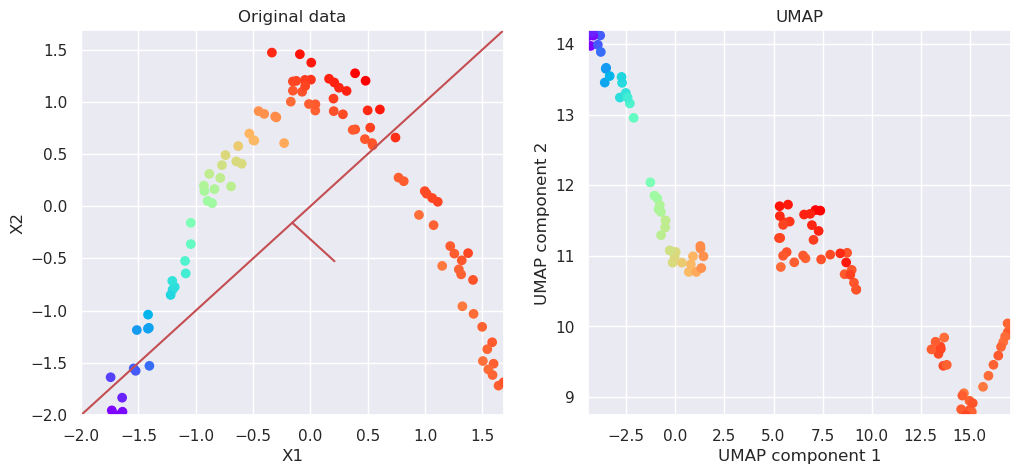
5.6. Uniform Manifold Approximation (UMAP)#
import umap
reducer = umap.UMAP(n_components=2)
Xp=reducer.fit_transform(Xs)

# Plot the original data and transformed data side by side
fig, (ax1, ax2)=plt.subplots(nrows=1, ncols=2, figsize=(12,5))
plotData(Xs, ax1, xlab='X1', ylab='X2', title='Original data')
plotData(Xp, ax2, xlab='UMAP component 1', ylab='UMAP component 2', title='UMAP', noline=True, fs=False)
5.7. More non-linear data#
k=0.1
N=100
x1=np.random.rand(N)
x2=k*np.random.rand(100)+(1-k)*x1
x2=k*np.random.normal(0,0.5,size=N)+(1-k)*np.sin(3*x1)
Xnl=np.vstack((x1,x2)).T
m=np.sqrt(Xnl[:,0]**2+Xnl[:,1]**2)
plt.figure(figsize=(5,5))

Xs=scale(Xnl)
plt.figure(figsize=(5,5))
plotData(Xs)
var=X.var(axis=0); k=var[1]/var[0]; plt.text(-0.2, 0.4, "k=%4.2f" % (k));
<Figure size 500x500 with 0 Axes>
5.7.1. PCA can not reduce dimensionality#
# Perform PCA decomposition
pca=PCA(n_components=2)
Xp=pca.fit_transform(Xs)

# Plot the original data and transformed data side by side
fig, (ax1, ax2)=plt.subplots(nrows=1, ncols=2, figsize=(12,5))
plotData(Xs, ax1,xlab='X1', ylab='X2', title='Original data')
plotData(Xp, ax2,xlab=' PC 1', ylab='PC 2', title='PCA', noline=True)
pca.explained_variance_ratio_
array([0.52803192, 0.47196808])
5.7.2. Aply t-SNE#
from sklearn.manifold import TSNE
tsne=TSNE(n_components=2)
Xp=tsne.fit_transform(Xs)


# Plot the original data and transformed data side by side
fig, (ax1, ax2)=plt.subplots(nrows=1, ncols=2, figsize=(12,5))
plotData(Xs, ax1, xlab='X1', ylab='X2', title='Original data')
plotData(Xp, ax2, xlab='t-SNE component 1', ylab='t-SNE component 2', title='t-SNE', noline=True, fs=False)
5.8. Apply UMAP#
reducer = umap.UMAP(n_components=2)
Xp=reducer.fit_transform(Xs)

# Plot the original data and transformed data side by side
fig, (ax1, ax2)=plt.subplots(nrows=1, ncols=2, figsize=(12,5))
plotData(Xs, ax1, xlab='X1', ylab='X2', title='Original data')
plotData(Xp, ax2, xlab='UMAP component 1', ylab='UMAP component 2', title='UMAP', noline=True, fs=False)
5.9. Application to handwritten digit recognition#
The handwriting recognition dataset contains 1797 digitized hand written written characters. The characters are digitized using 8x8 grid, so each sample is represented by 64 parameters. Each parameter can have a value from 0 to 15.
The original data is 64 dimensional, so it is difficult to visualize.
from sklearn.datasets import load_digits
digits = load_digits()
print(digits.data.shape)
(1797, 64)
5.9.1. Print some of the numbers in the database#
# Plot the first samples of each number

# First create a array of 10 subplots in one row
fig,axn=plt.subplots(nrows=1, ncols=10, figsize=(10,2))

# Select one example of each character and plot them in separate subplot
for i in range(10):
    # Select one subplot. axn can contain a two-dimensional array
    # of subplots. flatten() shrinks the structure
    ax=axn.flatten()[i]

    # Plot the data as an 8x8 array, using grey colormap
    ax.imshow(digits.data[i,:].reshape((8,8)), cmap='Greys')

    # Disable the numbers in x- and y-axes by setting them as empty lists
    ax.set_xticks([])
    ax.set_yticks([])

5.9.2. Dimensionality reduction using PCA#
Apply PCA to the data, keeping at first up to 32 dimensions to study how much variance is explained by each principal component.
pca = PCA(32)  # project from 64 to 32 dimensions
projected = pca.fit_transform(digits.data)
print(digits.data.shape)
print(projected.shape)
plt.plot(np.cumsum(pca.explained_variance_ratio_))
plt.plot(pca.explained_variance_ratio_)
plt.title('The variance explained by each PC')
plt.xlabel('Number of PCs included')
plt.ylabel('The variance explained / %')
(1797, 64)
(1797, 32)
Text(0, 0.5, 'The variance explained / %')
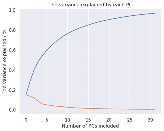
It looks like quite many dimesions are needed, to keep the information in the dataset, but let’s try to plot it in 2D anyhow.
plt.figure(figsize=(6,6))
plt.scatter(projected[:, 0], projected[:, 1],c=digits.target,
    edgecolor='none', alpha=0.5, cmap='rainbow', s=10)
plt.xlabel('Principal component 1'); plt.ylabel('Principal component 2')

for i in range(10):
    j=(digits.target==i)
    x,y=np.median(projected[j,:2], axis=0)
    plt.text(x,y, "%d" % (i))
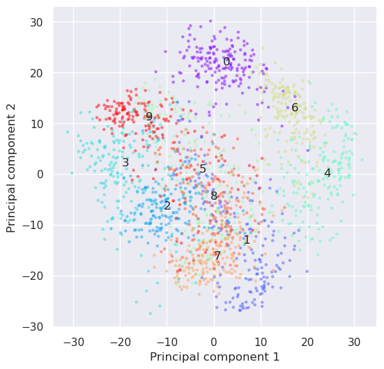
The result is not retaining enough information to be able to recognize characters any longer. Let’s try if nonlinear methods would work. How about t-SNE?
from sklearn.manifold import TSNE
tsne=TSNE(n_components=2)
Y=tsne.fit_transform(digits.data)

plt.figure(figsize=(6,6))
plt.scatter(Y[:,0], Y[:,1], c=digits.target, edgecolor='none', alpha=0.5, cmap='rainbow', s=10)
plt.xlabel('The first component'); plt.ylabel('The second component')

for i in range(10):
    j=(digits.target==i)
    x,y=np.median(Y[j,:], axis=0)
    plt.text(x,y, "%d" % (i))
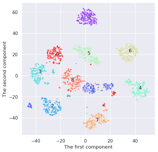
And how would UMAP work
reducer=umap.UMAP(n_components=2)
Y=reducer.fit_transform(digits.data)

plt.figure(figsize=(6,6))
plt.scatter(Y[:,0], Y[:,1], c=digits.target, edgecolor='none', alpha=0.5, cmap='rainbow', s=10)
plt.xlabel('The first component'); plt.ylabel('The second component')

for i in range(10):
    j=(digits.target==i)
    x,y=np.median(Y[j,:], axis=0)
    plt.text(x,y, "%d" % (i))
    print(i,x,y)
0 18.300037 9.862164
1 -1.9827087 7.3410726
2 8.617082 2.541314
3 -4.2107677 11.675339
4 4.6630735 17.776304
5 1.6551871 1.3155327
6 2.886955 -6.225762
7 -2.065316 20.219103
8 -1.6699129 9.157543
9 2.5998836 9.276968
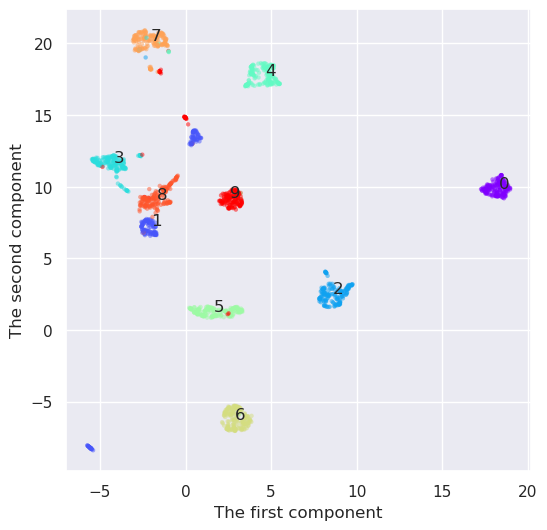
UMAP seems to create the densiest clouds around each number, but it has also an additional benefit as compared to t-SNE. I has also a inverse transformation. Lets select some points from the transform space and convert them back to feature space. They should resemple some digits.
Remember though, that the UMAP transformation is partially stochastic, and it is therefore slightly different every time is is recalculated, unless the random seed is set before fitting the transformer.
test_pts=np.array([[9,5], [17,9], [9.4, 5.1], [1,8]])
more_digits = reducer.inverse_transform(test_pts)
fig,axn=plt.subplots(nrows=1, ncols=4, figsize=(4,2))

# Select one example of each character and plot them in separate subplot
for i in range(4):
    ax=axn.flatten()[i]
    ax.imshow(more_digits[i,:].reshape((8,8)), cmap='Greys')
    ax.set_xticks([])
    ax.set_yticks([])

5.10. Umap plotting#
As shown, the data projected by UMAP can be plotted with matplotlib as normal, but UMAP library comes also with some special plotting methods, if you want install umap-learn[plot]. Let’s try some
import umap.plot
/home/petri/miniforge3/envs/octave/lib/python3.11/site-packages/umap/plot.py:20: UserWarning: The umap.plot package requires extra plotting libraries to be installed.
    You can install these via pip using

    pip install umap-learn[plot]

    or via conda using

     conda install pandas matplotlib datashader bokeh holoviews colorcet scikit-image

  warn(
---------------------------------------------------------------------------
ImportError                               Traceback (most recent call last)
Cell In[30], line 1
----> 1 import umap.plot

File ~/miniforge3/envs/octave/lib/python3.11/site-packages/umap/plot.py:31
     19 except ImportError:
     20     warn(
     21         """The umap.plot package requires extra plotting libraries to be installed.
     22     You can install these via pip using
   (...)
     29     """
     30     )
---> 31     raise ImportError(
     32         "umap.plot requires pandas matplotlib datashader bokeh holoviews scikit-image and colorcet to be "
     33         "installed"
     34     ) from None
     36 import sklearn.decomposition
     37 import sklearn.cluster

ImportError: umap.plot requires pandas matplotlib datashader bokeh holoviews scikit-image and colorcet to be installed
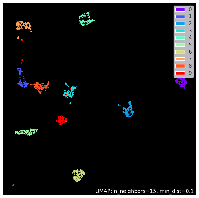
umap.plot.points(reducer, labels=digits.target, theme='fire')
<Axes: >
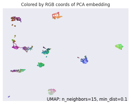
umap.plot.diagnostic(reducer, diagnostic_type='pca')
<Axes: title={'center': 'Colored by RGB coords of PCA embedding'}>
#umap.plot.connectivity(reducer, show_points=True, labels=digits.target, theme='fire')
#umap.plot.connectivity(reducer, edge_bundling='hammer', labels=digits.target, theme='fire')
#plt.savefig('UMAP_connectivity.png')
The estimation of connectivity plot with edge blunding is very time consuming but looks nice. Therefore I just add the result here

5.10.1. Handwritten digits case#
Linear methods were not succesfull retaining enough information for handwritten digits recognition when the dimensionality of data was reduced from 64 to 2. The explained variance ratio inferes that quite many principal components, like more than 10 would be needed for this problem.
t-SNE was able to capture better the structure of the originally multidimensional data only in 2D. It does not have an inverse transformation, and it is not therefore as generally usefull than PCA, but it is very usefull for example in visualizint multi-dimensional data.
UMAP was the best at this time. It looks like it would be quite straightformad to implement a method for handwriting recognition using only two dimensions. It has also an inverse transformation, and it was possible to convert the points from the transformation space back to feature space. It is often usefull, when analyzing the nature of some samples in transformed space.
The non-linear methods were clearly slower than PCA, especially UMAP takes a lot of time to compute.
PCA is the simplest to understand, and fastest to use.
5.11. Conclusion#
PCA is a powerfull method for transforming data into low dimensional subspace
PCA learns linear dependences between variables (correlation) and removes it, so that projected variables are uncorrelated
PCA transformation can be reversed, and the transformed data converted back to the original domain
If dependencies between variables is non-linear, then PCA cannot model it efficiently, and more components are needed
Manifold learning methods, such as Multi-Dimensinal Scaling (MDS), Isomap, Locally Linear Embedding (LLE), t-distributed Stochastic Neighborhood Embedding (t-SNE) and Uniform Manifold Approximation (UMAP) can learn also non-linear dependencies producing lower dimensional subspace for presenting data
All of these methods, except UMAP, try to keep the neighborhood information. Those samples which were close to each other are also close after projection. In these samples blue dots stays together and the order between samples is also kept.
References
I. T. Jolliffe, “Discarding Variables in a Principal Component Analysis. Ii: Real Data,” Journal of the Royal Statistical Society: Series C (Applied Statistics), vol. 22, no. 1, pp. 21–31, 1973, doi: 10.2307/2346300.
Q. Guo, W. Wu, D. L. Massart, C. Boucon, and S. de Jong, “Feature selection in principal component analysis of analytical data,” Chemometrics and Intelligent Laboratory Systems, vol. 61, no. 1, pp. 123–132, Feb. 2002, doi: 10.1016/S0169-7439(01)00203-9.
I. T. Jolliffe, “Discarding Variables in a Principal Component Analysis. I: Artificial Data,” Journal of the Royal Statistical Society: Series C (Applied Statistics), vol. 21, no. 2, pp. 160–173, 1972, doi: 10.2307/2346488.
C. M. Bishop, “Pattern recognition and machine learning,” CERN Document Server, 2006. https://cds.cern.ch/record/998831 (accessed Oct. 02, 2020).
Leland McInnes, John Healy, James Melville, “UMAP: Uniform Manifold Approximation and Projection for Dimension Reduction” in PDF in Arxiv, 2020